
Summary
- Role: Manager of Content Design, self-directed
- Status: Proposal, not yet built
- Deliverables: IA proposal, interactive prototype, updated object model
- Tools: Figma Make, Claude Code
- Collaboration: N/A
I was talking to my Senior Director at Docusign about my frustrations with the Information Architecture of the site and she indirectly put down a challenge: what if we redesigned it from the ground up instead of doing what we normally did (i.e. play around at the margins and how that will lead to massive usability gains).
I have a habit of diving deep into problems that I find interesting, so I took her seriously, built a prototype, and wrote a report about how we could fix our IA. At first glance, I was convinced that it was a large, structural problem. But the more I played around with things the more I realized that while there were structural issues, the real problem was in our terminology and taxonomy.
Luckily, we could fix both at the same time.
The problem
To take a step back, the IA at Docusign is a real, documented issue. We ran some numbers and they showed that ~70% of support tickets were about “how does this work/where do I find this” and search only succeeded 46% of the time. These are pretty appalling numbers.
I’ve had some suspicions about why those numbers are so bad, so let’s lay out the immediate problems.
Problem 1: Two navigation systems at the same time
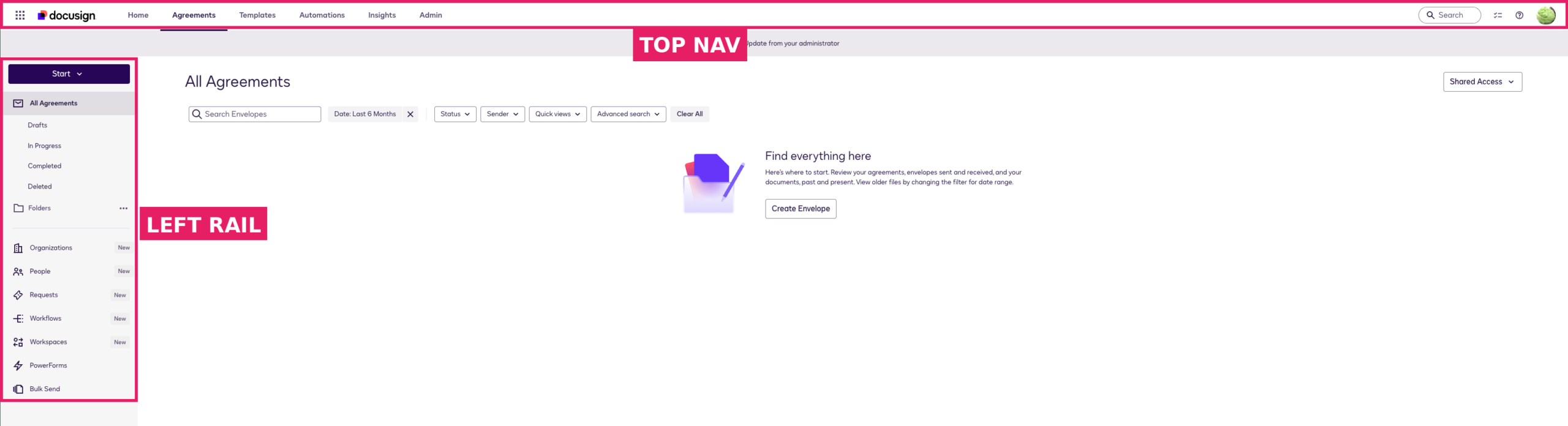
Docusign has two, seemingly unrelated navigation systems running at once; there’s a global top bar (Home/Agreements/Templates/Automations/Insights/Admin) and a separate left rail that changes depending on the context of where the user is. Frustratingly for our users, they have to infer the relationship because nothing in the UI clarifies the relationship. This is a documented failure, our users don’t understand how the platform is organized. As you can see in the screenshot, there’s also a tone of empty space here on the right, which means a huge chunk of the actual content on the screen is this navigation overhead.
The fix is to merge these two disparate systems into one nav that behaves consistently.
Problem 2: The start button is doing too much
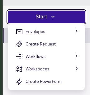
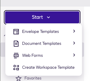
- 2-3 sentences about what was working and what wasn’t
Another fairly large issue is that Docusign has put a ton of disparate actions and objects into the start button’s scrolling menu and then has nested actions underneath those objects. That raises things users might be doing once ever (e.g. creating a PowerForm) to the same level as something they may do many time a day (e.g. sending an envelope). This hierarchy is incoherent and as we add new objects they just get added into this without a ton of consideration, making things even more bloated.
Problem 3: Wait why are we separating this stuff?

Another genuine issue is that we split related things onto their own page. The agreements tab is a great example; we have separate pages for Drafts, In Progress, Completed, and Deleted. This makes it harder for users to find the agreements that they are looking for and leads to support cases from frustrated users. And the real killer: we make this same strategic mistake across other object categories.
Plus, envelopes, which is Docusign’s main object, is not represented in the UI. In a very literal sense the ability to send envelopes is what our customers pay us for.
As I did a deep dive into the existing IA and content, it became really clear to me that Docusign’s broad categories were really fine. But the fragmentation and taxonomy really need to be change.
The approach
- Tools to build the prototype: Figma Make, Claude Code
- I explicitly wanted to avoid a rebuild. Every recommendation is a simple label change, a consolidation or merging of concepts. This should be easy-ish to implement while helping the users greatly.
- Highest-leverage changes from the existing UI that are worth noting:
- Pushing everything into one navigation which surfaces all the different objects quickly and easily for users.
- Consolidated 21 scattered actions into one primary send button, and one create button per section. This keeps the most-used actions close at hand for every user while keeping the less-used create options in the right section. This is a scalable system.
- I pushed for object type as a navigation, while using ownership as a filter for the objects.
- The home page summarizes things for the user. It doesn’t own anything.
- Instead of Agreement Desk, there’s Tasks and Requests. The former is what is asked of you, the latter is what you’re asking of others. This aggregates most of what a user is looking for in just two, plain language places.
Click through it yourself
Systemically changing the object model
As part of this exercise, I decided to redo the taxonomy and create a new object model. The principle here is that: each objects gets a single name, a single home where it’s created and managed, and defined places where it’s used. There are still some tensions, particularly in that my object model and left-nav has 9 items. But staying flat helps users, so I didn’t want to get away from that.
| Object | What it is | Built / managed in | Used in |
| Agreement | The thing being authorized — the central object | Agreements | Everywhere |
| Document | A file inside an agreement; a component, not a container | Agreements | Agreements, Agreement Desk |
| Template | A reusable starting point for an agreement | Templates | Agreements |
| Web form | A self-service form that produces agreements | Templates | Agreements |
| Workflow | A defined sequence of steps | Workflows | Agreements, Agreement Desk |
| Agent | An autonomous actor that acts with latitude | Agents | Agreement Desk intake, workflow steps, review |
| Iris | The AI engine beneath the above — not an object users create or manage | (not user-facing as a place) | Attribution across the product; the “Ask Iris” assistant |
| Task | Something asked of you | (nothing — Tasks only aggregates) | Tasks |
| Request | An intake item awaiting preparation | Agreement Desk | Agreement Desk |
| Contact | A person who participates in agreements | Contacts | Agreements, Agreement Desk |
| Workspace | A shared collaboration space | Workspaces | Agreements |
| Folder | User-defined organization for agreements | Agreements | Agreements |
| Report / Dashboard | A saved analysis of agreement data | Insights | Insights |
What would I change
Honestly, I’m pretty happy with the process I undertook and the place I ended up. But there’s always ways to improve the work. Next time, I would work on:
- The process: While doing this self-directed gave me a lot of freedom to do what I wanted, that freedom also means there are unavoidable blind spots. It would have been great to partner with other people on this, even if just so my assumptions could have been challenged.
- The feasibility: I didn’t partner with anyone from Product or Engineering on this effort. This isn’t inherently a problem for self-directed vision work. But in hindsight it would have been really good to get some perspective on just how feasible something like this is.
How would I measure this
Because it’s self-directed, this kind of thing can be tough to measure. But some basic ideas I have:
- Re-run tree tests on our top findability tasks.
- Track search success rate and measure against the against the 46% benchmark.
- Track share of “where is…” / “how do I…” tickets against the ~70% benchmark
- A note: we should measure “Ask Iris” usage separately from the question of findability. While AI can help users find stuff quickly, if we see a lot of rising “How do I find {thing}”-type queries inside Iris, we know the IA is defective. If things are going well, users are going to be using AI to get answers and analysis about their agreements, not have to burn tokens to find their stuff.
What happened?
Well, because this was internal and self-directed nothing immediately changed. But after it was shown to executives, my prototype did help open up the possibility of really changing our IA. More to come, hopefully.
But even if nothing happens immediately, this exercise really sharpened my analytical thinking and pushed me to think in terms of systems that scale.